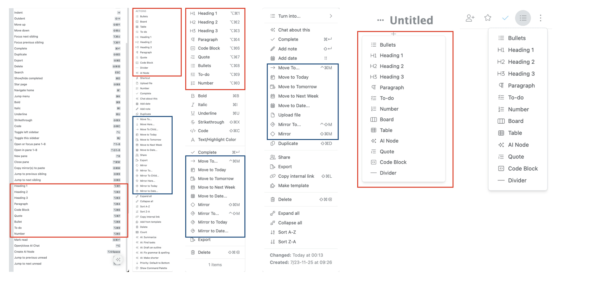
As WorkFlowy continues to introduce powerful capabilities — such as AI nodes, board views, tables, and date operations — the right-click context menus, item action menus, and inline creation menus have become increasingly long and difficult to scan.
By contrast, the Command Palette and Hotkeys reference pages offer clean alignment, distinct grouping, and high scannability. Bringing this same level of structure and visual hierarchy to WorkFlowy’s menus would make core features instantly accessible without slowing down editing flow.
Current Usability Challenges
- Menu Overcrowding & Vertical Bloat
- Inconsistent Ordering Across Menus

- Subtle Feature Erasure (in some menus)
Proposed Solutions
- 1. Grouped Section Headers & Visual Dividers
- 2. Collapsible Sub-menus or Flyouts
- 3. Mirror the Layout of the Command Palette and Hotkeys
Why This Matters
WorkFlowy’s core strength is speed and frictionless outline navigation. Standardizing and organizing context menus will prevent visual overwhelm for pro users while making new features far more discoverable for beginners.