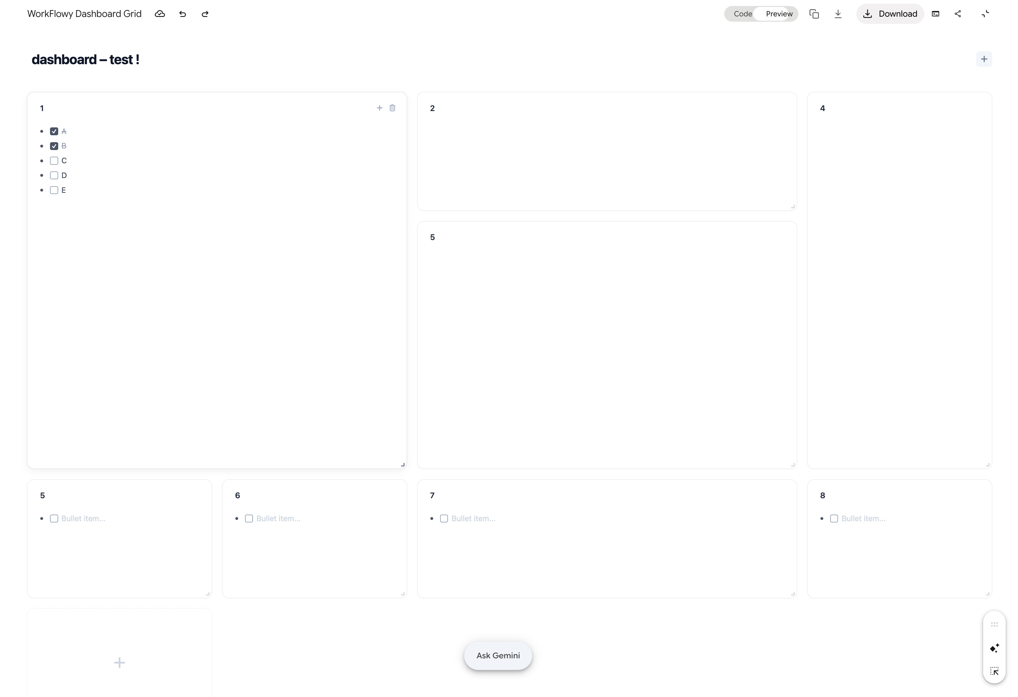
Hi everyone ,
Following up on the ongoing discussion regarding the state of Dashboards in Workflowy ( reference : Forever labs/beta > dashboards; from good to bad to atrocious ) — I wanted to create a dedicated thread with a concrete mockup and core principles to move the dashboard conversation from frustration to solutions .
For context , many of us remember the early vision / mockups shared by Frank D . years ago . Dashboards held immense potential to transform Workflowy from an outliner into a true central workspace hub , but the feature has suffered from instability and lack of iteration over the years .
Here is a proposed redesign layout and core feature set to make Dashboards genuinely useful , performant , and true to Workflowy’s minimalist philosophy .
Why Bring This Back Now ?
Dashboards bridge the gap between deep hierarchical outlining and high-level productivity overview . A functional dashboard turns Workflowy into an all-in-one daily command center .
Please vote for this post and share your thoughts or additional wishlist features below !
( Note : The interactive HTML/CSS grid prototype shown in the recording was built using Gemini in under 3 minutes . )