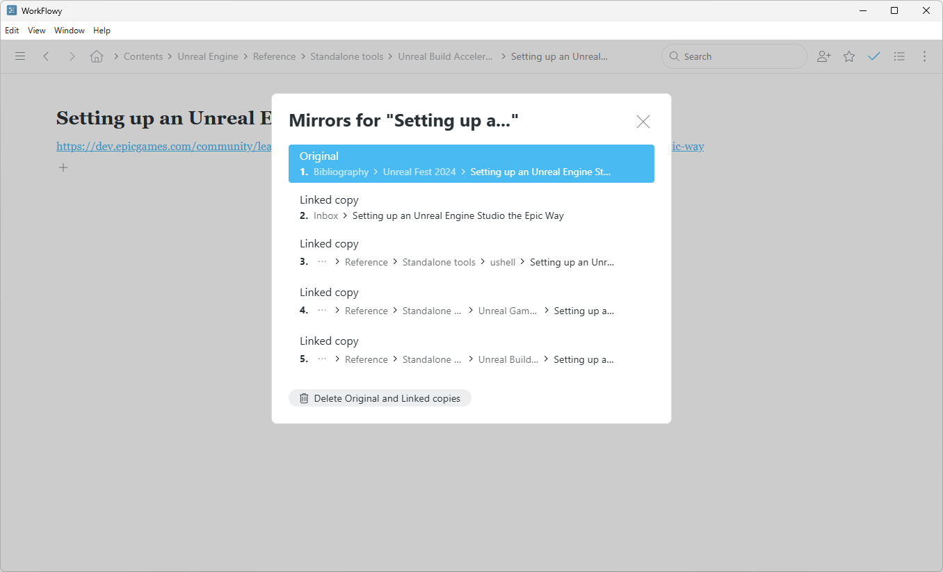
In its current state it’s quite hard to interpret the contets of the window.
- Multiple repeating elements that do not carry any useful information and only add noice.
- It’s very narrow and doesn’t scale; paths to the parent bullets (the only information that actually matters) are stripped with “…” and are left to be guessed.
- Vertical distance between elements is very large, 800px of my screen would barely fit 10 elements.
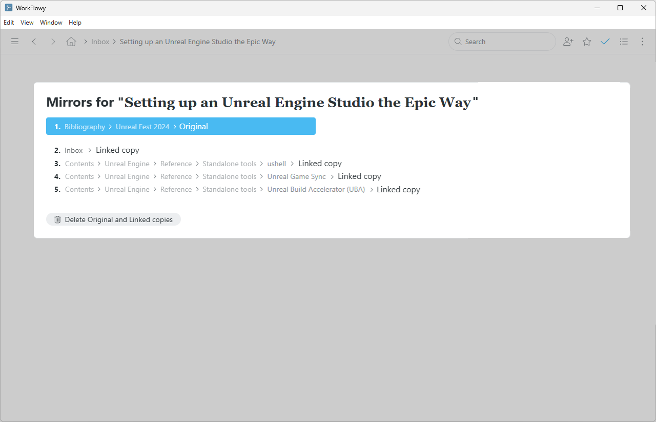
Compare to this version. A plain list that expands from left to right is much clearer and easier to follow: