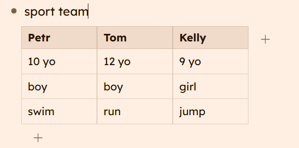
Navigation during table creation is a bit unintuitive
No way to see whether a bullet (a cell) has children
Can’t double click to automatically resize columns to fit width
Sometimes the column width expands to fit as I type new text, other times it does not
Perhaps a bit too easy to overwrite existing content in a cell by dragging another cell on top of it
Conclusion: My first impression is that this is a niche tool, but I appreciate having a new display. I have a feeling others will find this very useful.
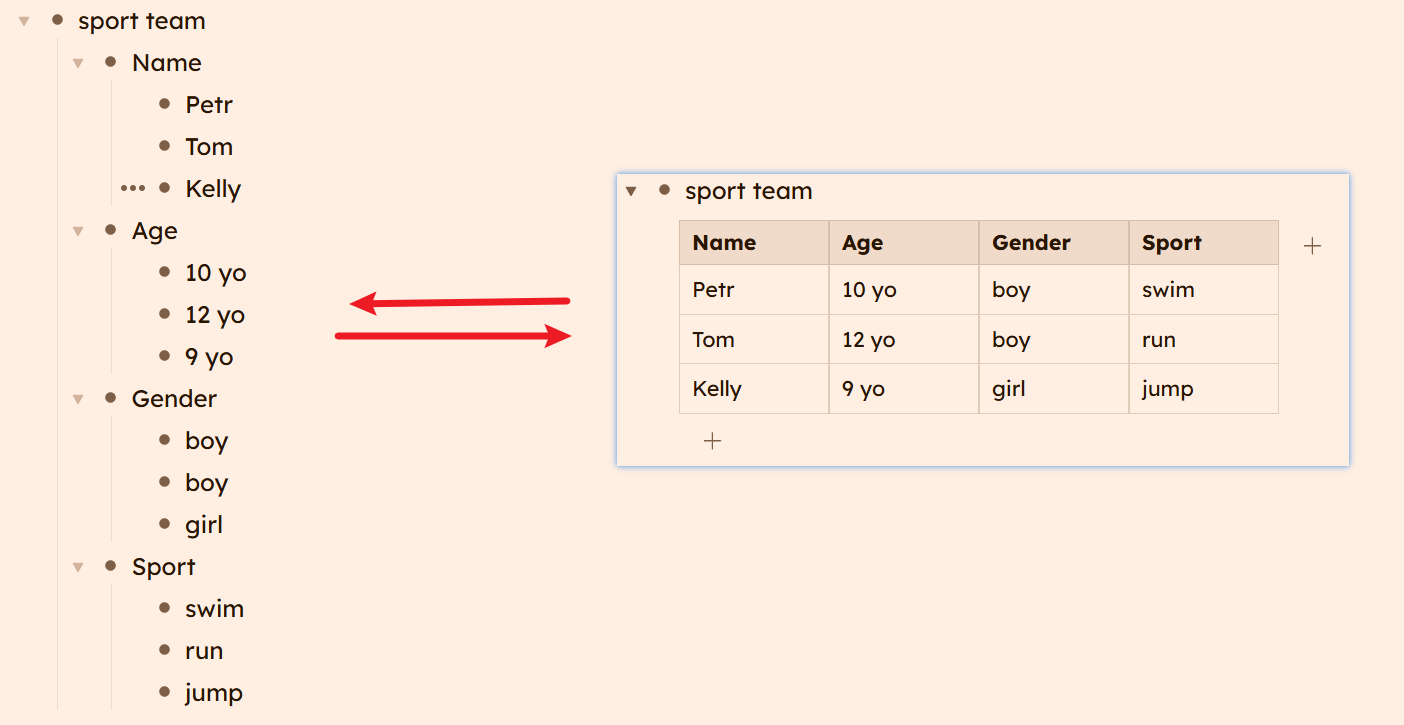
I’d like to see the table transposed (1st level child nodes = lines in table)
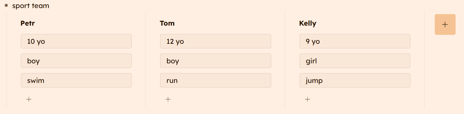
Context of each record relies on the order of 2nd level children. When the view changes to board, bullet list, or dashboard the context changes (to list of the same property x all objects). Also the way it is now it looks pretty much like a board (see the s/s below)
Do I miss any advantage of this setup?
Additionally: It would be great to have in/export to/from CSV
Nicely presented, @smallgrip6167 . There was a lively debate about this topic on the Workflowy User Group slack channel. This morning, Phil from Workflowy posted:
Thanks for all the feedback on Tables, and as a result we’re shifting from a columns-first approach to row-first.
Why? We went back and forth on this and columns-first was the fastest way to get something real in your hands. Your insights about data integrity made it clear that row-first was the right approach.
As a result, existing tables are likely to be fragile, so, for now, we’d recommend not building anything important with them. More soon.
Maybe? Or rely on folks like me who check the slack group often. I go there in part because I enjoy Workflowy and the community. I also go there for a healthier break: I open the slack page so that I don’t open Reddit.
Just having tables as superficial formating is a huge step that im very thankfull for
Definitely row-first is the way to go, and nodes having both row and column association is the end goal
A big quality of life improvement would be having copied tables being pasted into WF as tables - but I realise this is probably way easier said than done and therefore something that will happen later in the process
I’m loving it - tables are a huge improvement for me for a particular project I’m working on.
Would be even happier if there were a way to style the tables - reduce header row thickness, change the background color, hide or recolor the lines separating cells, etc. Accessible thru css would be fine.
I took a quick look at the css for the wf tables in my document, and it’s rather opaque; haven’t tried manipulating it, yet.
I’ve been trying out the new Table feature and wanted to share some feedback from my experience, as I suspect I’m not the only one running into this.
I start from data already organized as bullet points, with several levels (a main title, then sub-points underneath). When I turn this list into a table, my level-1 title — the one that identifies each row (a folder name, a reference number…) — disappears completely from the display. Only the sub-points below it show up as cells. It took me a while to realize the content wasn’t actually lost, just invisible: you have to zoom into the row to find it again.
I eventually understood the underlying mechanism by pasting a table from Excel and then switching it back to “bullets” view: it turns out you actually need to add an extra level above your level 1, called “row.” I can rename that level if I want it to be easier to read when I switch back to bullets mode — but that name never shows up in the table itself. In practice, this means extra restructuring work for every row, and reduced readability whenever I switch back to regular list view (with this artificial “row” level, which has little meaning outside the table, inserted everywhere).
The end result: the information I want to see first — “what is this row about” — doesn’t show up anywhere in the grid, unless I add that empty level above each item before converting.
It would be practical to be able to display this first column (level 1) and to pin/freeze it as a reference column for each row — a bit like a frozen pane at the start of a table in Excel or Google Sheets.
I wanted to share this experience in the hope it might help improve things — especially for anyone who, like me, starts from an existing list rather than building the table from scratch.
Thanks for the work put into this feature, which otherwise has real potential.
I want to post a couple suggestions regarding the tables feature.
First, I agree with Anne Marneffe above regarding first-level items: they should appear as the first column in the table. No point in displaying details if you don’t know what the details refer to.
Second, consider supporting self-identifying second-level children. For example:
Mr. Green
phone: 2125552121
age: 52
Miss Scarlett
phone: 2024441212
town: Washington
Mrs. White
class: 1978
phone: 8882023232
This could map to a table with column header text already provided:
item           phone        age  town       class
Mr Green       2125552121   52
Miss Scarlett  2024441212        Washington
Mrs White      8882023232                   1978
The data that corresponds to a table column would not depend on position but rather the tag or prompt.
And, in the opposite direction, entering data via the table would be an easier way of entering prompted second-level details for the bulleted outline.
Thanks for the continued innovation and thoughtful design.