I would like to use the Todo checkboxes, but I avoid them simply because their design is overly busy. I don’t think we need the visual of the dot next to the Todo item. I use workflowy because it is CLEAN. The dot could show up on hover over, just like the paragraph bullets work. It’s probably code that could be reused.
4 Likes
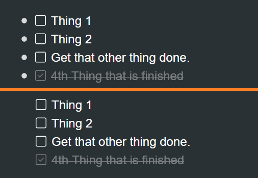
I find the bullets AND the check box annoying. You can remove the bullet via CSS. This is the code I use:
/* Hide bullets for Todos */
.checkmark > .name > .bullet {
  opacity: 0;
  transition: opacity .25s;
}
/* Show todo bullets on hover */
.checkmark > .name > .bullet:hover {
  opacity: 1;
  transition: opacity .25s;
}
/* Move Todos Left */
.checkmark > .name {
  left: -21px;
}
/* Hide add sibling button so it doesn't interfere with Todo expand/item menu */
.checkmark .addSiblingButton {
  display: none;
}
This will hide the expand/collapse arrows, too, if you have any children under the todo node. I toggle the “Always show expand/collapse arrows” toggle in settings so I can see if there are nodes under the todo.
I am not a CSS person (or a coder), but I keep a shared list of CSS snippets that others have posted on the Slack channel:
CSS Snippet Shared Library
2 Likes
Wow! Thanks eric. This is a huge discovery to find out about! I can’t believe it works across mobile app too!
I do think this should be the default, but this is certainly a way to fix it for me.
Hello.. How can you set in workflowy desktop app / mobile app a CSS?
1 Like
This is what I use to insert CSS into my Workflowy:
Once you enter your code, it will show up on all Workflowy platforms (web, desktop, mobile).
1 Like